17 Tips from Designers for Creating a Cohesive Website
Creating a cohesive website requires mastering fundamental design principles that work together harmoniously. We asked industry experts to share one tip they would give to designers who are struggling to create a visually cohesive and branded experience across all pages of a website — and one key element you should focus on. Discover useful approaches to establishing consistent hierarchy, developing unified design systems, and building strong visual foundations that communicate a brand’s essence.
- Establish Heading Hierarchy Before Layout Design
- Design All Pages Together On Paper First
- Define Visual Logic Before Creating Layouts
- Create Visual Language Guide Before Layouts
- Translate Brand Character Into Component Library
- Standardize Spacing With Consistent Scale System
- Master Three Pillars For Effortless Brand Trust
- Choose One Emotional State As North Star
- Develop Unified Rules That Eliminate Guesswork
- Build Typography As Brand Backbone First
- Build Systems That Define Element Behavior
- Create Documented Design System With Clear Rules
- Accessibility Drives Design Cohesion Naturally
- Develop Style Guide As Design Foundation
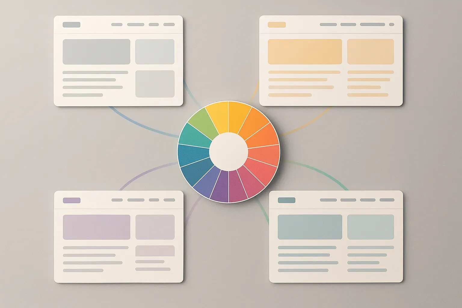
- Assign Purpose To Each Color Tone
- Maintain Recognizable Soul Through Consistent Hierarchy
- Stick To Clear Design System From Start
Establish Heading Hierarchy Before Layout Design
Lock in your heading hierarchy before anything else.
Focusing too much on page layouts too early is one mistake I see designers make when struggling with visual consistency.
Our team once worked on a site for an accounting firm. Now, each page had been designed by a different freelancer over time. Fonts were technically the same, but the way headings, subheadings, and body text were styled or not styled varied wildly, so it made the whole site feel disjointed, even though the colors and logos were consistent.
So instead of starting with a brand moodboard or rebuilding layouts, we decided to focus only on type structure, what H1s should look like, how H2s behave across devices, and what spacing to maintain around paragraphs. Funny how this one fix created immediate cohesion, even before we updated the color palette or visuals.
So, before you touch the site layout or anything else, get your headings in order. If it’s off, everything feels off.

Design All Pages Together On Paper First
Ok, so my advice is two part: Start on paper and design all pages together as a set.
Sounds a bit archaic, but for me, starting with pen to paper (or rather pencil to paper) always leads to better end results in terms of design, layout, flow, and consistency. I’m a massive tech fan, but sometimes analog is just better.
The brain works differently analog to digital, and I find if I create wireframe sketches on paper first, when I jump into the computer, the design task changes to something a bit more methodical where I’m digitising what I already created on paper and then applying colour and brand assets, etc., which creates a very strong cohesive brand experience.
The second part is to design all pages together. Many designers will design the home page and then send to client for approval before designing subsequent pages. I disagree with this approach, as a website is a whole asset and breaking it up disrupts the flow of creativity than if you were to create all pages together. Breaking it up also means the client isn’t seeing the whole picture in how the website pages all work together and limits their ability to visualise what the end result would look like.
If you use my method, then ALL pages are sketched on paper and then ALL pages digitised, the end result will absolutely be a recognisable brand that’s cohesive across the entire site.

Define Visual Logic Before Creating Layouts
If your website feels visually inconsistent, it’s usually not a color or typography issue — it’s a decision-making issue. Designers often focus too much on making each page look “great” in isolation instead of designing a consistent visual logic that connects everything.
The key is to define a clear visual hierarchy system before touching layouts: heading sizes, text spacing, button styles, and container widths. Once those foundations are locked, every page becomes a variation, not a reinvention.
Another underrated fix is to align every visual decision with the brand emotion you’re trying to evoke. Ask, “What should users feel on every page?”
That single emotional anchor simplifies choices, from photography to shadows, and makes the experience cohesive even when layouts differ.

Create Visual Language Guide Before Layouts
If I had to give one tip to designers struggling to create a cohesive, branded experience, it would be to start with a “visual language guide” first, before pushing forward with any layouts. When I first started my career, I tended to dive straight in and start designing pages, only to halfway through the project discover that my fonts, colours, and spacing were all over the place.
Now I create a simple one-page style sheet that defines brand colors, typography rules, button effects, and image treatments; it’s like carrying a mini design compass. The actual emphasis needs to be on keeping typography and spacing consistent; they fly under the radar and do all the heavy lifting to make a site look neat and professional. After that is established, the rest of the branding seems to naturally fall into place.

Translate Brand Character Into Component Library
My main tip would be to create a design system that represents your brand’s purpose and identity. Consistency ensures that every design decision is telling the same story, emotion, and value that is key to your brand’s essence. We start every web project by taking a brand’s strategy and translating it into a visual language that works across touchpoints. We develop the relationship between a brand’s typography, color, spacing, and imagery that communicates the brand’s character. Once we’ve translated that character into things that we can build with, we create a robust component library that designs consistency and scalability across every touchpoint.
This process creates visual rhythm, provides brand familiarity and builds a better experience for the user. When a design system is developed correctly, the user experience feels seamless and intuitive considering all elements are intentional to facilitate this experience from end to end. If I were to point to one thing that I, personally, view as most important, it would have to be consistency in typography and spacing. Typography and spacing are predominantly the cause of establishing all the elements of visual hierarchies, readability, and tone, which inherently directs the user through the interface. Implementing consistency not only achieves an aesthetic design but also builds trust and confidence with the brand for the user throughout the experience.

Standardize Spacing With Consistent Scale System
Focus on consistent spacing, not colors or fonts. Most designers obsess over matching blues and typefaces, but inconsistent spacing is what actually breaks cohesion. Your users’ eyes notice when padding jumps from 16px to 24px between pages more than they notice slightly different grays.
Set up a spacing scale (like 8, 16, 24, 32, 48, 64px) and use nothing else. Every margin, padding, and gap should come from that scale. This creates an invisible rhythm users feel even if they can’t articulate it. Switching to a strict 8-point grid system was the single change that made our platform feel “designed” instead of “assembled.”
The magic happens when spacing becomes systematic. Buttons get the same internal padding everywhere. Cards have consistent margins. Headers maintain the same distance from content. This spatial consistency creates cohesion even when colors and content vary dramatically between sections.
Practical tip: Start by auditing your current spacing. You’ll likely find random values like 13px, 27px, 35px scattered everywhere. Replace them all with your nearest scale value. The visual improvement is immediate and dramatic. One client told us their site finally felt “professional” after we did nothing but standardize spacing.
Colors and fonts matter, but spacing is the skeleton that holds everything together. Fix that first, and the rest becomes much easier to manage.

Master Three Pillars For Effortless Brand Trust
Keep it to the fundamentals. Cohesion doesn’t come from adding more; it comes from being intentional and consistent. Designers often look for complex solutions when, in reality, consistency in a few key areas does most of the heavy lifting. Start with the three pillars: typography hierarchy, colour consistency, and spacing. When these are aligned, the entire design system feels trustworthy and effortless. If any of them are slightly off (if your headings vary in size, your colour tones shift from page to page, or your spacing rhythm breaks) the design will subconsciously feel “off.”
Use your brand elements with purpose. You don’t have to reinvent the wheel on every page; instead, let your core components: buttons, grids, and typography scales repeat and reinforce recognition. Consistency is what makes a brand feel confident.
And finally, think in systems, not pages. Build a clear visual logic that guides users from one interaction to the next with the same rhythm and clarity. When every element feels like it belongs to the same visual language, users stop noticing the design and start feeling the brand.

Choose One Emotional State As North Star
The secret to a cohesive, branded website isn’t colors or fonts. It’s voice discipline.
Most designers look for consistency in visuals, but forget the emotional through-line. A brand isn’t just how it looks; it’s how it feels to move through it.
Pick one emotional state your brand should evoke. Is it calm, confident, rebellious, or luxurious? Then use it as your north star. Every single choice you make, from typography spacing to button microcopy, should echo that same feeling and be firmly anchored to it.
When the voice, visuals, and energy speak the same language, cohesion happens naturally. Only then does design stop being “decoration,” and it becomes brand embodiment. A beautiful thing!

Develop Unified Rules That Eliminate Guesswork
To create a visually cohesive brand experience across your website, focus on developing a well-defined design system that eliminates guesswork. From header weights to margins, your style guide should serve as a single source of truth — a tool that ensures every visual decision supports a unified brand identity and smooth flow from page to page.
A design system transforms your brand’s visuals into tangible, repeatable rules. It standardizes every color, font, icon, and layout component so branding feels seamless across all pages and even across different mediums like tri-folds or social graphics. Small inconsistencies — an off-shade button or mismatched line height — quickly make a site feel disjointed and unpolished, which lowers user trust and weakens perceived professionalism.
I recently completed a site redesign for a local coffee lounge, and the key to solving their brand inconsistencies was building a mini design system around four core rules: a cream accent palette, rounded corners, geometric sans-serif typography, and warm-toned imagery.
By setting precise global styles in Elementor — linking colors, font weights, line heights, and spacing — we ensured those choices carried through automatically to every new page or section. The end result was a cohesive, polished design that reflected the brand’s identity without requiring constant manual adjustments.
When every pixel follows a unified visual language, your website not only looks consistent but also feels intentional. A documented system keeps your design scalable, professional, and unmistakably on brand every single time.

Build Typography As Brand Backbone First
Think of your typography and color not just as design choices but as the backbone and personality of your whole brand. Picking a few favorite fonts or colors isn’t enough. Start by building a tidy, repeatable library that spells out how headers, body text, and buttons should look and feel. Give each text style a clear job, from the bold H1 down to the quiet hint text, so every page feels connected and easy to read.
Typography is more than letters on a screen. It’s the architecture and the voice that shape a user’s whole experience, giving rhythm and harmony to every page. A sturdy type scale, where each heading, chunk of text, and label knows its place, creates a sense of order. That consistency helps people find what matters and makes your product instantly recognizable.
And when it comes to color, treat it like the mood lighting and paint on the walls. Color is what brings feeling and energy to your design, but without strong typography underneath, everything can start to feel a little chaotic. Get your font sizes, line heights, and spacing sorted first. Once the structure is strong, your brand colors will sing, and your whole design will feel easier, brighter, and more welcoming.
A clear and consistent system for type and color doesn’t just impress but also helps everyone on the team create better work faster and gives your brand a distinct, trustworthy personality.

Build Systems That Define Element Behavior
Focus on consistency through systems, not aesthetics. Build a design system with visual logic (type scale, spacing, motion, tone, etc.) that defines how elements behave, and not just how they look. When every decision follows the same underlying system, cohesion becomes automatic.

Create Documented Design System With Clear Rules
Designers who want to solve their visual element consistency problems should start by creating a single design system. The process requires establishing uniform typography rules, color schemes, spacing guidelines, and button design standards, which need to be documented. The process requires more than visual appeal because it needs to create logical patterns that can be used again. All design elements need to serve their designated purpose while following established design principles. A well-documented design system allows teams to scale creativity while maintaining brand integrity.
The organization needs to establish a defined organizational structure as its initial priority. Your brand identity will maintain consistency through visual weight management on every page by using headline size, button color, and whitespace in a consistent manner. The site maintains an intuitive user experience through its hierarchical structure, which creates visual connections between different sections.

Accessibility Drives Design Cohesion Naturally
Cohesion thrives when accessibility drives design, not aesthetics alone. Inclusive design principles create consistency because clarity benefits everyone equally. Legibility, contrast, and spacing discipline ensure universal usability across audiences. When accessibility leads, unity follows effortlessly. Every accessible choice naturally doubles as a cohesive one.
We discovered this while redesigning for accessibility compliance across client portfolios. Consistency improved alongside inclusivity because structure demanded uniform standards. Accessibility aligns brand ethics with user experience seamlessly. Inclusion, we’ve realized, is the purest form of cohesion possible. Good design always feels kind before it feels clever.

Develop Style Guide As Design Foundation
When creating a cohesive website experience, I always recommend developing a comprehensive style guide. This becomes your design foundation, ensuring consistent application of colors, typography, and logo placement across every page. If I had to identify one critical element to focus on, it would be brand consistency. This consistency creates a unified, professional presence that visitors immediately recognize and trust. A well-executed, consistent brand experience transforms disconnected pages into a seamless journey that reinforces your identity at every touchpoint.

Assign Purpose To Each Color Tone
Color consistency influences cohesion but requires more discipline than designers often expect. Each hue should serve a purpose within the emotional hierarchy intentionally. We assign meaning to every primary and accent tone: confidence, calm, or innovation. This structured symbolism translates mood consistently across environments. Unplanned colors dilute brand emotion quietly.
We implement minimal palettes, then expand gradually once tone consistency stabilizes. Simplicity builds strength faster than variation does. Teams quickly see engagement improve through visual restraint. Color psychology, applied strategically, strengthens trust subconsciously. Discipline in color expression is a designer’s silent storytelling power.

Maintain Recognizable Soul Through Consistent Hierarchy
To me, consistency is much less about cloning pixels, but more so about maintaining a recognizable soul. If your brand were a person, would its voice, wardrobe, and posture match from page to page? Most designers forget that coherence is actually less visual and more emotional.
The one thing to focus on is hierarchy. Not color, not font, but hierarchy. It’s like the rhythm section of design. Define how your brand guides attention: type scale, whitespace, interaction patterns. Nail that, and everything else falls into sync like a jam session.
Your site should feel like one continuous breath, not just a slideshow of competing moods. Once hierarchy is consistent, even chaos can look intentional. Feel free to trim or adjust this to suit the article, and happy to elaborate further if needed.

Stick To Clear Design System From Start
One key tip I’d give is to build and stick to a clear design system from the start — consistent typography, color palette, spacing, and button styles. Even small inconsistencies can break the visual flow. Focus on alignment and hierarchy — when every element feels intentional, the entire site naturally looks more cohesive and on-brand.