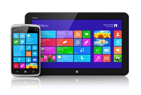
devxlogo

Java ME User Interfaces: Do It with LWUIT!

Java ME User Interfaces: Do It with LWUIT!

ne of the hardest things about developing Java ME applications, especially for Connected Limited Device Configuration (CLDC)/Mobile Information Device Profile (MIDP) apps, has been trying to figure out how to build a palatable graphical user interface. Just getting the job done is hard enough given the restrictive Limited Capability Device User Interface (LCDUI) API. Trying to build user interfaces that are engaging and “rich” is pretty close to impossible. There have always been options for building the UI, but the options usually leave developers choosing between easier-to-build/poor looking displays versus harder-to-build/better-looking displays and potential portability issues. Thus many consider the “Limited Capability” part of the LCDUI acronym an understatement. At this year’s JavaOne conference (held in early May), Sun unveiled a fountain of hope for Java ME developers responsible for user interfaces.

What You Need


Introducing LWUIT
The Lightweight UI Toolkit or LWUIT (pronounced loo-it by Jeet Kaul, Sun Vice President, Client Software Group) is a free UI library and tool for creating richer and more portable Java ME user interfaces.

According LWUIT team member Yoav Barel, “LWUIT was inspired by Swing and its design.” That becomes immediately apparent when you start to work with the feature set LWUIT brings to Java ME user interfaces. LWUIT’s rich set of UI components, layout management, animation and transitions, and themes should even impress graphical designers and user interface specialists.

The current version of the library works on top of CLDC/MIDP. However, Sun plans to make the library available on other Java ME platforms such as the Connected Device Configuration. If successful in making the library available on other configurations and platforms, this would make LWUIT a true cross-platform capability and help to eliminate a major source of device fragmentation issues that occur at the graphical user interface level.


Java ME Display and Portability
There have always been development options when creating GUIs for Java ME applications. The problem has been that none of the options have been great.

The CLDC/MIDP LCDUI high-level user interface API provides lowest common denominator capability. This gives applications maximum portability at the cost of smart displays. While the high-level API is functional and abstracts developers from low-level drawing details, it forces UIs into a pre-defined look and feel. Alternatively, MIDP LCDUI low-level API requires developers to “paint” graphical primitives (text, images, lines, rectangles, and arcs) to develop the application’s UI. This painstaking work often results in more compelling UIs, but since the low-level API grants access to details that are specific to a device, it can result in less portable applications.

More recent Java ME specifications define optional Java ME support for Scalable Vector Graphics (SVG) and even some of the Java SE graphics and user interface capability (see JSR 209: Advanced Graphics and User Interface). However, as they are optional, developers are again handcuffed to a limited set of devices.

For the Connected Device Configuration (CDC) there is the full featured Abstract Windows Toolkit (AWT), but if an application needs to run across the CLDC and CDC, the same portability issue arises.

Of course, there are third-party libraries and tools such as J2MEPolish, Paxmodept, Twuik, or Nokia’s eSWT. Cost, portability (especially across configurations), and standard support are issues when considering third-party libraries.

The display capability of mobile devices, while sometimes impressive given the size of the device, varies greatly from platform to platform. Finding a single, rich display, easy-to-use API that abstracts developers away from the low-level details while also porting to the multitude of mobile platforms has been hard, but it’s exactly the purpose behind LWUIT.

Stated right in its documentation, LWUIT “tries to avoid the ‘lowest common denominator’ mentality.” It achieves this goal by implementing its own set of abstracting component classes on top of the native system canvas.

Getting and Setting Up LWUIT
An early access release of the LWUIT, including the class library, documentation, tools and example code is available here under a Sun License Agreement. As of this writing, toolkit source code is not yet available (see LWUIT future below).

The early access release comes in the form of a single 5.25MB zip file. The LWUIT library jar (lwuit.jar) should be extracted from this zip file and made available to your Java ME project. Using NetBeans, this means adding the JAR to your project (see Figure 1). Using Sun Java Wireless Toolkit for CLDC, add the JAR to the tool’s libext folder and bundle the JAR with the project (see Figure 2). The Sprint Wireless Toolkit version 3.3 has already been configured to work with LWUIT. When creating a project with the Sprint toolkit, simply choose to create a LWUIT project. As with any JAR, the API is available to the classes of the application via simple import.


Figure 1. Add LWUIT to a NetBeans Project: Select the Projects tab, right-click on Resources, choose Add Jar/Zip…. Locate the LWUIT JAR file using the browse window.
 
Figure 2. Adding LWUIT to a Wireless Toolkit Project: Click on the Settings… button on the WTK toolbar as shown. In the Settings dialog, pick the External APIs icon and make sure the LWUIT JAR is bundled with the project.

The LWUIT JAR is about 225KB. While not insignificant, the power LWUIT packs makes it well worth the space allocation.


A Simple LWUIT Application
Using LWUIT is about as easy as it is to set up. First, from inside of the MIDlet (the startApp() method for example), initialize LWUIT.

Display.init()

The Display class manages LWUIT rendering and handles events. It is also used to place top level components, called forms, on the screen. Forms are created with simple constructors and then “shown” on the display.

Form myform = new Form();myform.show();

Between the Form creation and showing, it’s a matter of creating, configuring, and adding user interface widgets (text box, button, and so on) to the Form:

Figure 3. The Application Launch Screen: LWUIT themes, use of resource files, layout management, and clean widgets can make a MIDlet form like this initial application page look like an application selector.
Form myform = new Form();Button myButton = new Button("Push me");myform.addComponent(myButton);myform.show();

It’s that easy. For a more in depth example, this article’s sample application demonstrates some of the power and functionality in LWUIT. It’s a simple application consisting of a single MIDlet (see Listing 1) that allows student data to be collected and displayed on a mobile device.


The first screen of the application allows the user to select from a set of “virtual” applications by selecting from what looks like a set of icons. In this screen, one can also see how the use of resource files and “themeing” (a concept discussed later in this article) applies background images and a general look and feel to the application (see Figure 3). Using a simple image scaling mechanism, the buttons with images that serve as icons can even be made to look as if they are being depressed.

From the main application selection screen, a user can select a student record for editing from a LWUIT List widget and use LWUIT buttons to remove or add a student (see Figure 4).


Figure 4. LWUIT List and Buttons: The List widget conveniently displays any array or Vector of objects.
 
Figure 5. Data Entry with LWUIT: The List widget set is more comprehensive that MIDP’s LCDUI and control and display of the widgets are also more in the developers’ hands.

The student editing screen shows many common widgets available in LWUIT (TextArea, ComboBox, Calendar, and so on) that are familiar to Swing developers. The editing screen also makes extensive use of LWUIT Layout Managers to provide a user interface that almost looks desktop-like in nature. Figure 5 shows the List widget set, which is more comprehensive that MIDP’s LCDUI. It also places the control and display of the widgets more in developers’ hands.


Significant Features
While a complete examination of the LWUIT features and API is beyond the scope of this article, the list of significant features below should help wet your appetite and leave you feeling that Java ME user interfaces can rival those of the Swing or rich internet applications.

Figure 6. LWUIT GUI Component Hierarchy: As in Swing/AWT, the base class of all widgets in Component (from the com.sun.lwuit package).

Swing-Like Widget Set
Inspired by Swing, LWUIT offers a rich set of graphical user interface components that will be familiar to Swing/AWT developers. Just like in Swing, the root class of graphically displayed widgets like lists, combo boxes (selection widget), text areas, buttons, radio buttons and check boxes is Component (see Figure 6).

Also like Swing/AWT, LWUIT utilizes the composite pattern to allow nesting of components. A Container object is a Component that contains other Component objects. The container allows layout properties to be applied to the collection of Components independent of the rest of the display.

Many of the common “widgets” (text box, button, and so on.) are demonstrated in Listing 1 above. The real strength and power of LWUIT comes in how much more control you have of layout and display characteristics (color, font, and so on) of these widgets (all covered later). However, there are some differences in the actual components themselves. In order to highlight a couple of the differences between LWUIT and MIDP’s LCDUI, explore these examples.

  1. Lists with Real Objects: A List widget is available in LCDUI. However, the choices in a LCDUI List are Strings and images. This makes adding a collection of records to the list for display difficult (see Listing 2) and makes associating the selected choice back to the original element in the collection even more difficult.

    Using LWUIT, a List can be handed an array or Vector of Objects (see Listing 3). Getting the selected object is as easy as calling on the getSelectedItem() method on the LWUIT List object. Figure 7 shows a comparison of MIDP’s LDCUI List and LWUIT’s List. Both accomplish the mission of displaying a list of data, but getting the data in an out of the LDCUI’s List requires a great deal of String manipulation. LWUIT’s List works with a collection of objects to get and set the list model.


    Figure 7. MIDP’s LDCUI List vs. LWUIT’s List: Getting the data in an out of the LDCUI’s List requires a great deal of String manipulation. LWUIT’s List works with a collection of objects to get and set the list model.
     
    Figure 8. LWUIT’s TabbedPane: Users can pick between student info and the student picture displays here. The look and feel is of a multiple dimensional or “page” user interface that typifies desktop applications.


  2. The TabbedPane:: Given the tight real estate on many handheld mobile device screens, the ability to break up the display into multiple “pages” is usually a necessity. The TabbedPane serves as a container that allows the users to see the pages of the display in a tabbed notebook. Figure 8 shows how TabbedPane allows the user to pick between student info and the student picture displays, gives users the look and feel of multiple dimensional or “page” user interface that typifies desktop applications. Nothing like this exists in MIDP’s LCDUI short of developers building it themselves with the low-level API.

Significant Features (cont’d)

Swing-like Event Handling
Events and rendering calls are all managed by the Display class in LWUIT. This class manages a single main thread (called the Event Dispatch Thread) that encapsulates the platform specific event delivery. LWUIT’s event model is based on AWT 1.1’s event architecture and generally operates as Swing/AWT does today. Thus, developers need only implement one of callback/listener interfaces in LWUIT’s com.sun.lwuit.events package and register it with LWUIT in order to react to events (such as data changes, focus changes, actions, and selections) that occur in the components. Listing 4 shows code for an ActionListener and how to associate it to widgets. This listener, from the application shown above, reacts to students being selected, as well as the student “remove” and “add” button requests.

Figure 9. LWUIT’s Layout Managers: From left to right: FlowLayout, BorderLayout, BoxLayout, and GridLayout.

Swing-like Layout Management
Layout management is also borrowed from Swing/AWT. In fact, layout management can help negotiate the differences in platform display sizes; along widgets to be displayed based on the dimensions of the screen rather than some fixed position. LWUIT offers a subset of the familiar Swing/AWT layout managers: FlowLayout, BorderLayout, BoxLayout, GridLayout, and GroupLayout. Swing/AWT does offer many more layout managers. However, when LWUIT’s layout managers are used together with the Container for grouping components, these five offer significant control and flexibility over the device dictated layout management associated with LCDUI. For those that are unfamiliar with or have forgotten the basic layouts, examples of four of the five options are shown in Figure 9. From left to right are: FlowLayout (components are placed left to right in rows), BorderLayout (the screen is divided into directional north, east, south, west and center areas for components), BoxLayout (components are laid out in a single vertical or horizontal row—vertical is displayed here), and GridLayout (components are arranged in a square or rectangular grid—a 2×2 grid is shown in this example (GroupLayout offers more complex layout management that cannot be easily demonstrated).

Styles and Themes
Mobile devices, cellular phones in particular, are considered extremely personal items. So much so that a person’s identity is usually somewhat reflected in their choice of device and how it is customized and configured. Most cell phones promote this customization by offering users the ability to pick a “theme” which controls the general look and feel of applications that run on the phone. There is even a Web site dedicated to offering themes (no lie—check out www.myfonethemes.com).

Figure 10. Widgets with Style: All LWUIT Components have an associated Style object. Here the Style object for a TextArea and Button are set with dramatically different Font and colors to highlight how Components Style objects can be used.

To support this demand, LWUIT defines a Style object that dictates the colors, fonts, transparency, margin, padding, and background image for each Component. Every LWUIT Component has an associated Style object. While setting and changing the Style object of each individual Component is possible (see Listing 5 and Figure 10 for an example), developing and using a theme is the preferred means to set the look and feel of an application.

Figure 11. The ResourceEdit Tool: LWUIT provides this tool to create and edit resource files. Resource files can contain images, fonts, themes, etc. that can be used by your Java ME applications to provide consistent look-and-feels.

A theme is a collection of color, font, transparency, margin, etc. properties. LWUIT’s themes are similar in concept to cascading style sheets for web applications or Swing’s Pluggable Look and Feel (PLAF) mechanism. A theme is stored in a resource file and is loaded and applied to all Components (or more appropriately to all Component Style objects) in the application. In the sample application, the intertechTheme.res file was loaded via LWUIT’s Resources and UIManager to apply the Intertech, Inc.’s corporate colors, background logo, and look and feel to the demonstration application.

resources = Resources.open("/intertechTheme.res");UIManager.getInstance().setThemeProps( resources.getTheme(resources.getThemeResourceNames()[0]));

The theme of an application, or Style object to any Component, can change without affecting the behavior of the application.

To help in the creation of the theme resource files, LWUIT ships with ResourceEdit (see Figure 11). This is a standalone tool that provides a preview mechanism helps you see the resulting look and feel on all of the components as the theme is being developed.


Significant Features (cont’d)

Painters
A Painter is an interface that allows you to implement code that draws on a Component’s background within the bounds of the Component’s area. A Painter interface requires the paint method to be provided that draws inside the desired image inside the components rectangular clipped area. A Painter object is then used through a Component’s Style object. As an example, the code in Listing 6 provides a reusable painter that puts a red box around a Component (see Figure 12); perhaps to highlight a potentially “dangerous” user option. Once coded, the Painter can be set as the background painter on any Component’s Style object (see Listing 7).


Figure 12. Highlighting a Button with a Painter: Painters allow custom drawing to be done on a Component via its Style object as shown by painting a red box around this Button.
 
Figure 13. Example Transitions: Transitions allow the change between Form objects to take on flair. The examples above show the change between two forms caught in mid-transition using slide, fade, and 3D rotate transitions.

Transitions
To spice up those Java ME user interfaces, you might also want to consider using a bit of animation. No, not the dancing Duke type of animation (although LWUIT can help you do that too), but adding animation that helps provide a visual indicator to the user when the form or page changes. In LWUIT, changes between Forms can be made more visually acute with the addition of a transition. This feature is not unlike setting up animation between slides in PowerPoint. There are several types or modes of transition: slide, fade, and 3D transitions. A slide transition allows one form to replace the existing form display by moving in from either the left, right, top or bottom. A fade transition causes one form to gradual fade away while displaying the second form. On devices that support the Mobile 3D Graphics API, additional 3D transitions are possible (fly in, cube rotation as shown in Figure 13, flip rotation). A LWUIT transition class allows animation to simply be added to a form (either as a transition into the form or out of the form). In the example shown below, a slide out transition is set from the first form of the sample application to the student list form. The parameter false indicates the transition should occur left to right (versus right to left), and the parameter 1000 is the time it should take to complete the transition to the next form (in milliseconds):

        iconForm.setTransitionOutAnimator(CommonTransitions.createSlide(CommonTransitions.SLIDE_HORIZONTAL, false, 1000));

To set up a fade transition, call on createFade instead of createSlide on the CommonTransitions class:

iconForm.setTransitionOutAnimator(CommonTransitions.createFade(1000));

As an example of using a 3D transition, use the Transition3D class and call the createRotation() method to have the current form appear as if it is flipped over to the next form:

iconForm.setTransitionOutAnimator(Transition3D.createRotation(1000, true));

Logging
Logging is a basic need in any application. As it is not available in many Java ME environments, developers have had to roll their own into their applications. As a surprising bonus, the LWUIT library offers a simple logging framework. The logging framework allows developers to log to the Java ME record management system (RMS) storage or the file system. The Log class and static p methods allow developers to write to the log, wherever it is:

Log.p(“I am in here”);

Common to most logging frameworks there are four log levels available: Debug, Info, Error, and Warning.

But Wait, There’s More!
Again, there is not enough space to cover all of LWUIT’s capabilities. In addition to the features shown here, what other features might you want to research? Here are a few others:

  • Built in support for touch screens
  • Built in support for Mobile 3D Graphics (M3G) API for J2ME
  • Localization/Internationalization support

LWUIT Documentation
Unlike many early release projects, LWUIT comes with a pretty good set of documentation. The Javadoc API documentation is not thick (many methods contain a single line of documentation), but it is complete. For more details, take a look at the Developer’s Guide. This 115 page PDF document, which is distributed with the download ZIP file, provides more explanation about LWUIT features and often provides example code for how to use LWUIT classes. The download also comes with a sample application that demonstrates most of the new toolkit. Finally, Jonathan Knudsen has also provided a nice set of introductory tutorials on many features and aspects of LWUIT. These can be found on the project’s web site.

LWUIT’s Future
The LWUIT library was just released for general public consumption at JavaOne. It is still an early access library, but as such it holds great promise. Expect the source code to be released this summer. In fact, Yoav Barel indicated in his talk at JavaOne that the LWUIT project would be put in open source this summer. As an open source project, one would hope and anticipate that, as its capabilities grow, its quality will improve and it will be ported to even more environments.


devxblackblue

About Our Editorial Process

At DevX, we’re dedicated to tech entrepreneurship. Our team closely follows industry shifts, new products, AI breakthroughs, technology trends, and funding announcements. Articles undergo thorough editing to ensure accuracy and clarity, reflecting DevX’s style and supporting entrepreneurs in the tech sphere.

See our full editorial policy.

About Our Journalist