You’ve spent weeks or months poring over data and finally crunching the numbers to get meaningful insights. You’re hungry for your audience to know how impactful your research is, but the story your data tells is being buried by spreadsheets, bulky reports, or PowerPoints full of bullet points and clip art. Don’t despair. You are not alone.
Design has the power to help researchers, marketers and students translate their data into something that’s accessible and engaging. Charts that aren’t intuitive, visuals that don’t align or videos with no context lose your audience no matter how incredible the research is behind it. Communicating your research clearly and creatively isn’t a nice-to-have, it’s a must if you want people to care about your research and retain what you’re sharing.
Fortunately, you don’t need to have a degree in graphic design or spend big bucks on big data visualization. We’ve compiled a list of 10 ways for even small business owners and their design teams to inject some creativity into their research.
Strategy 1: Make Your Data Accessible
Before you even start thinking about what chart types or styles you want to use, think about who will be consuming your research and how they will be consuming it. You want to make sure that you can be understood by everyone who views your data. Watch out for features like an AI video translator that can translate spoken languages in narrated data videos so that international audiences can understand what you’re saying.
Visualize with accessibility in mind, and label everything. Give all of your axes and data set descriptions clear and concise titles. Arrange information in a logical sequence that makes sense. Include captions or transcripts for your charts and videos. Include alt-text with visual elements to help screen readers better describe your data. Break up your visuals so they don’t become too crowded. Have someone who’s not a subject matter expert review your materials to ensure you’re not missing anything obvious.
Once you keep accessibility in mind at the start, you’ll be in a good position to help your audience clearly understand your research as you select your charts.
Key benefits:
- Provides context that can help any audience make sense of your research.
- Make sure they understand your data by labeling clearly, including captions, and using alt text.
- Eliminate confusion and potential for misinterpretation by presenting information in a logical way.
Strategy 2: Choose the Right Chart for Your Data
With your data accessible and ready to share, you’ll want to make sure that you’re visualizing the data in an easy-to-understand way. Charts can help communicate your findings or they can bury insights in confusing visuals.
Before you even think about design, take a step back and ask yourself what story you want your data to tell. Are you trying to highlight how two things compare? Use a bar chart. Want to show how something has changed over time? Go with a line chart. Looking for a way to show how two variables are related? Give a scatter plot a shot.
After you’ve picked a chart that matches the story you’re trying to tell with your data, consider how scaling works, labeling is done, and whether you can simplify it further. Remove any extraneous 3D effects or distracting design elements that take attention away from the data itself.
Key benefits:
- Allows you to pick the best format to showcase each type of data you have.
- Spotting patterns, making comparisons, and understanding data over time will be intuitive.
- Complex information will become easy for your audience to understand.
Strategy 3: Tell a Story With Your Data
While you can use data visualizations to clearly communicate your research, your data should always exist within a story. Data storytelling is an effective way to lead your audience through each step of your thought process, from providing context to delivering your research question and concluding with your findings.
Guide the audience through your visuals in a way that flows naturally. Use annotations, callouts, or bolding to emphasize your major takeaways. Review every chart and figure and ask yourself how it advances your narrative. Take a look at how your visuals could form a story. If you’re crafting a poster, leave room for short captions. If you’re making a slide deck, consider adding a voiceover.
Every data visualization you include should have a defined purpose and use. Build up to a problem, define patterns or trends, and close with a conclusion. Data storytelling will help your audience understand your takeaways, remember them, and hopefully inspire them to take action.
Key benefits:
- Provides audiences with context before showing them the patterns you want to highlight.
- Storytelling principles ensure the key takeaways of your research will stick with them long after they’ve read your paper.
- Enable your research to have a positive impact by motivating your audience to take action.
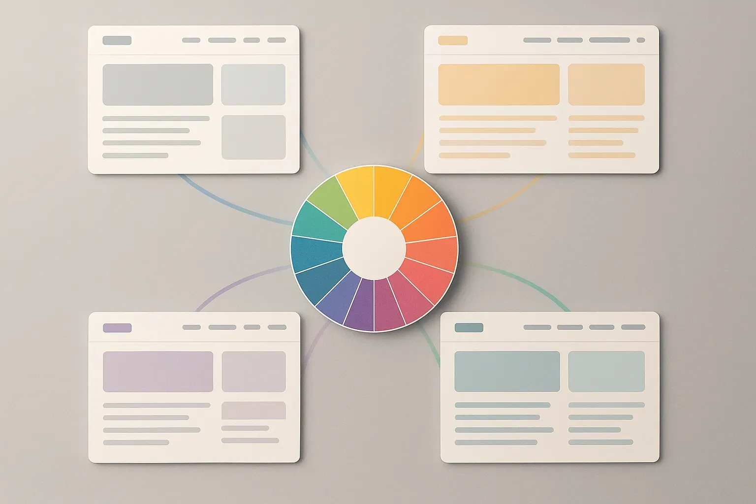
Strategy 4: Use Color and Design Thoughtfully
Your data’s finally accessible and your story is on lock. Now let’s make it pretty. Smart color and design choices can direct your viewer’s attention to important takeaways, create consistency across all of your visualizations, and make your charts look more polished, all while keeping things simple. Strong color schemes can help you visually separate data points, highlight key trends and relationships in your data, and create consistent, clean graphics.
Typography, spacing, and alignment play a role too. Use consistent fonts and clean charts that are well-spaced and easy to scan. These are small design choices you can make that don’t require a graphic designer. Something as simple as embracing white space to create separation between topics or using an accent color for one data series can really make your visuals pop and feel complete.
Icons, lines, and even backgrounds can help you visually separate data when you need to, while still keeping your viewer focused on what matters. Give some attention to your visualizations and watch your audience be drawn into your data.
Key benefits:
- Draws the eye to key trends and takeaways.
- Use color theory and design principles to craft charts that are beautiful and polished.
- Guides comprehension with thoughtful typography, spacing, and alignment.
Strategy 5: Incorporate Animation and Motion
Infusing your charts with motion can help your audience see trends and connections they may not otherwise notice. Simple animations like lines graphing a trend over time or bars that fill up can catch attention. GIFs or looped images with key data patterns allow you to summarize your charts in a quick and easy way.
Consider adding a video summary of your data trends and pair with a voiceover to provide valuable context. Don’t go overboard with animations though. You don’t want your audience focusing more on the fancy charts rather than what your data is saying.
Key benefits:
- Call attention to data that changes over time or highlights important trends.
- Move beyond static charts to craft visuals that will grab and hold your audience’s attention.
- Animations and videos can quickly summarize patterns that would take your readers dozens of words to explain.
Strategy 6: Layer Context for Clarity
It’s never a good idea to make your audience guess. Provide context to your data visualizations by adding annotations, data tooltips, reference lines, and small descriptive text boxes. Context will allow your audience to better understand the data you are presenting.
For example, if you want to showcase that your data has doubled over the past year, consider adding a horizontal line to denote that average. If you’re creating a dashboard, you can build in tooltips that reveal more context when your audience hovers over certain points.
By providing context, you eliminate any confusion your audience may have.
Key benefits:
- Helps paint a picture for your readers by allowing you to add elements like annotations, reference lines, or tooltips to your charts.
- Eliminate opportunities to confuse your audience by providing context they may need to understand certain baseline measures or benchmarks.
- Complex data becomes accessible and understandable. Easy for your audience to act on.
Strategy 7: Highlight Key Insights With Emphasis
Charts can often get lost when mixed with other data visuals. Don’t be afraid to use emphasis to draw your audience to the right spot. Use larger circles, brighter colors, or place important data points toward the top of your visualization to draw attention.
You can also use callouts and arrows to lead your audience to key changes in data or shading to group similar data points together. By using emphasis, you are able to create a better visual story and your audience will understand the main insights of your data quicker.
Key benefits:
- Ensure your audience’s eyes are drawn to the big takeaways.
- Using size, bold text, or visual positioning, you can convey the most important insights your audience needs to understand at a glance.
- Emphasis can make your visuals more compelling without creating clutter.
Strategy 8: Explore Creative Formats
After you’ve unlocked, clarified, and beautified your data, think about how you want to package it up to share. Sometimes we get stuck thinking about data visualizations as slides or charts. Other interesting ways to present data are infographics, posters, interactive PDFs, and dashboards.
Infographics (or information graphics) are useful tools to convey a story through visualizations, text, and statistics all in one image. They can be easily distributed digitally or printed out for easy sharing. Posters are similar to infographics, but allow you to include more visualizations and tell a bigger story.
Posters are great for conferences or classrooms. Interactive PDFs allow readers to interact with your data visualization in the form of PDFs — your readers can filter, hover, or click to unlock more data and content. Dashboards allow your audience to create their own visualization by inputting what they’re interested in seeing.
Getting creative with format is also important to consider. Who is your audience and how will they best understand your data? Would they prefer to watch a 2-minute explain data video or scroll through a multimedia interactive infographic? As a stakeholder, would you rather read a data memo or play around with a mini interactive dashboard to see data-driven scenarios unfold?
There are endless opportunities to package up data. Try a few different formats to figure out what makes your data sticky, actionable, and worth sharing.
Key benefits:
- Ability to package data into new formats like infographics, posters, or interactive PDFs will allow you to tailor your data to your audiences and how they’ll consume it.
- Your research will stick with them, and they are far more likely to share it.
Strategy 9: Make Your Data Shareable
Creating beautiful and insightful visualizations is half the battle. If people don’t see them, they won’t learn from your research. Build visualizations with sharing in mind by making it easy for people to distribute your data across channels and formats.
Can your visuals be shared on social media? Great-looking graphics that are tailored to specific platforms (square images for Instagram, vertical content for TikTok, horizontal imagery for LinkedIn) help get eyes on your work. Social media stories are another flexible tool you can use to share your research and turn engagement into leads. These short, vertically scrollable visual snippets give your audience the highlights of your findings in a format they use every day.
Presentations and slide decks can be considered for easy sharing too: is the text minimal and easy to digest? Are you only communicating the most important insights on each slide? You can also create PDFs of presentations with clickable links and interactive data dashboards that allow others to dig into the numbers. Don’t be afraid to embed your data visualizations in company blog posts and newsletters, either.
How do you consume content when you’re scrolling on your phone? Think about formats that allow others to skim the highlights: visual snapshots, short videos, scrollable graphics. By building with shareability in mind, you can help your work live beyond your desk.
Key benefits:
- Formats your visuals for easy sharing on social media channels and professional networks, as well as in presentations.
- Get your audience engaged and help them share your research through stories, social media posts, or interactive dashboards.
- Allow your data to reach longer and have a bigger impact than your research alone.
Strategy 10: Keep Improving With Feedback
Iteration is vital to improving your data visuals. Ask colleagues or stakeholders (or even friends outside your industry) for feedback on draft visuals. Are there labels they don’t understand? Do they notice trends you hoped they’d find? Do certain design decisions fail to convey your message? User testing is also helpful, but good old-fashioned colleague feedback can go a long way.
If you share your research visuals on an interactive dashboard, slide deck, or social media post, you can use analytics to track how users engage with different types of charts and graphs. Do certain charts get more clicks or hovers? Are specific graphics more likely to be shared? Use your findings to improve future data visuals. Maybe a certain color palette is more engaging, or your audience prefers clean left-aligned captions to bold center-aligned ones. Perhaps they respond better to interactive visuals than static ones. Maybe your stakeholders really love pie charts! It’s also okay to iterate on the type of visualization you use.
Take notes on what visual elements your audience responds to, and let those learnings inform your decision-making process next time. You should view every visualization as a chance to gather feedback.
Key benefits:
- Ability to collect feedback, conduct tests, and analyze how your visuals are being used will allow you to continuously improve how you present your data.
- You’ll know your next visualization will be better suited to your audience’s needs than the last.
- Instills a culture of testing and continuous improvement.
Bringing Your Data to Life
Data doesn’t speak for itself. It isn’t until you reach people that your data has value. Make your research clear, design it with intention, and allow it to be accessible for your work to reach more people. Thoughtful data visualization will allow you to tell stories with your data that your audience can understand and help propel them to your conclusion.
Striving for clarity and impact will allow each decision you make, from chart layouts to directing your viewer’s gaze, to make your work stand out. Done right, your data will feel alive.
Rashan is a seasoned technology journalist and visionary leader serving as the Editor-in-Chief of DevX.com, a leading online publication focused on software development, programming languages, and emerging technologies. With his deep expertise in the tech industry and her passion for empowering developers, Rashan has transformed DevX.com into a vibrant hub of knowledge and innovation. Reach out to Rashan at [email protected]